
In a world where first impressions matter more than ever, a logo isn’t just a pretty picture; it’s the face of a brand. Think of it as the superhero cape that gives a business its identity. Without clear logo guidelines, that cape could end up looking more like a potato sack.
Understanding Logo Guidelines
Logo guidelines define how to use a logo to maintain brand consistency. Adhering to these guidelines ensures a logo remains recognizable and impactful.
Importance of Logo Guidelines
Logo guidelines play a vital role in shaping brand perception. Consistent application of logo elements enhances professionalism and builds trust. They prevent misuse that can distort brand identity. Effective guidelines provide clarity, reducing confusion among team members and partners. Without them, logos may appear inconsistent across various mediums, leading to a fragmented brand image.
Key Elements of Effective Logo Guidelines
Effective logo guidelines include specific rules about logo usage. Sizes, colors, and clear space requirements ensure visibility and legibility. Different logo variations must be outlined for different backgrounds or applications. Typography guidelines should clarify fonts used in conjunction with the logo. Examples of correct and incorrect logo usage illustrate proper applications, reinforcing the guidelines.
Creating Consistent Branding
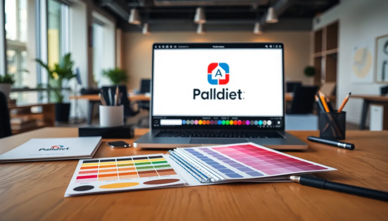
Maintaining consistency in branding involves careful attention to various elements. Color palettes and typography play critical roles in establishing a cohesive brand identity.
Color Palette
A defined color palette enhances brand recognition. Companies should select specific primary and secondary colors, providing hex codes and CMYK values for accuracy. Consistent use of these colors across all marketing materials solidifies brand identity. For example, Coca-Cola consistently uses its signature red alongside white. Therefore, using the same shades across digital and print formats reinforces brand visibility and recall.
Typography
Typography choices contribute to visual identity. Brands must adopt specific fonts, outlining acceptable usage for headings, body text, and digital formats. Arial might serve for digital media, while a serif font fits print materials. Legibility remains key; consumers engage more when text is easy to read. Starbucks’ use of a custom typeface strengthens its unique brand image. Adhering to typography guidelines ensures uniformity, fostering professionalism in communication.
Logo Usage Best Practices
Proper logo usage ensures brand recognition and professionalism. Adhering to specific guidelines enhances the logo’s impact and preserves its integrity.
Placement and Sizing
Logo placement should prioritize visibility and clarity. Center placement works well for digital platforms, while left alignment suits print materials. Always maintain a minimum size to preserve legibility, especially in smaller formats. Adhere to established guidelines that suggest a size limit of 250 pixels in width for web usage. Consistency in resizing retains brand integrity across various media. Position logos in a way that avoids clutter and distractions, allowing the logo to stand out.
Background Considerations
Background color greatly influences logo visibility. Ensure that logo colors contrast sharply against the background to maximize impact. Avoid busy patterns or images behind the logo that may complicate its visibility. Transparent backgrounds often enhance versatility, particularly for digital use. Additionally, specific color guidelines recommend the use of defined brand colors in backdrops to maintain a cohesive look. Following these considerations fosters a professional and consistent brand presence.
Common Mistakes to Avoid
Avoiding common mistakes in logo usage is critical for maintaining brand identity. Understanding these pitfalls can enhance professionalism and consistency.
Overcomplicating Logo Usage
Reducing logo complexity promotes better recognition. A busy logo can confuse audiences and dilute brand messages. Keep logos simple and memorable to strengthen impact. Brands often misstep by adding excessive elements or details. Sticking to core design principles ensures clarity in communication. Limit variations and adhere to predefined guidelines to maintain brand consistency. Every additional element can detract from immediate recognition, so simplicity matters.
Ignoring Accessibility
Making logos accessible broadens audience engagement. High contrast between logos and backgrounds ensures visibility for everyone, including those with visual impairments. Brands should prioritize color and font choices that accommodate various audiences. Not considering accessibility can alienate potential customers. Use web-safe fonts and ensure text is legible in different sizes. Testing logos across diverse devices and settings guarantees that they reach the intended audience effectively. Prioritizing accessibility enhances brand inclusivity and boosts overall perception.
Establishing clear logo guidelines is essential for any brand aiming to maintain a strong identity. By defining specific rules for logo usage and ensuring consistency in color and typography, brands can effectively communicate their values and foster trust among their audience. Avoiding common pitfalls and prioritizing accessibility further enhances a brand’s impact. Ultimately, a well-defined logo and its guidelines not only elevate professionalism but also create a lasting impression that resonates with consumers. Brands that invest in these elements will find themselves better positioned in a competitive marketplace.